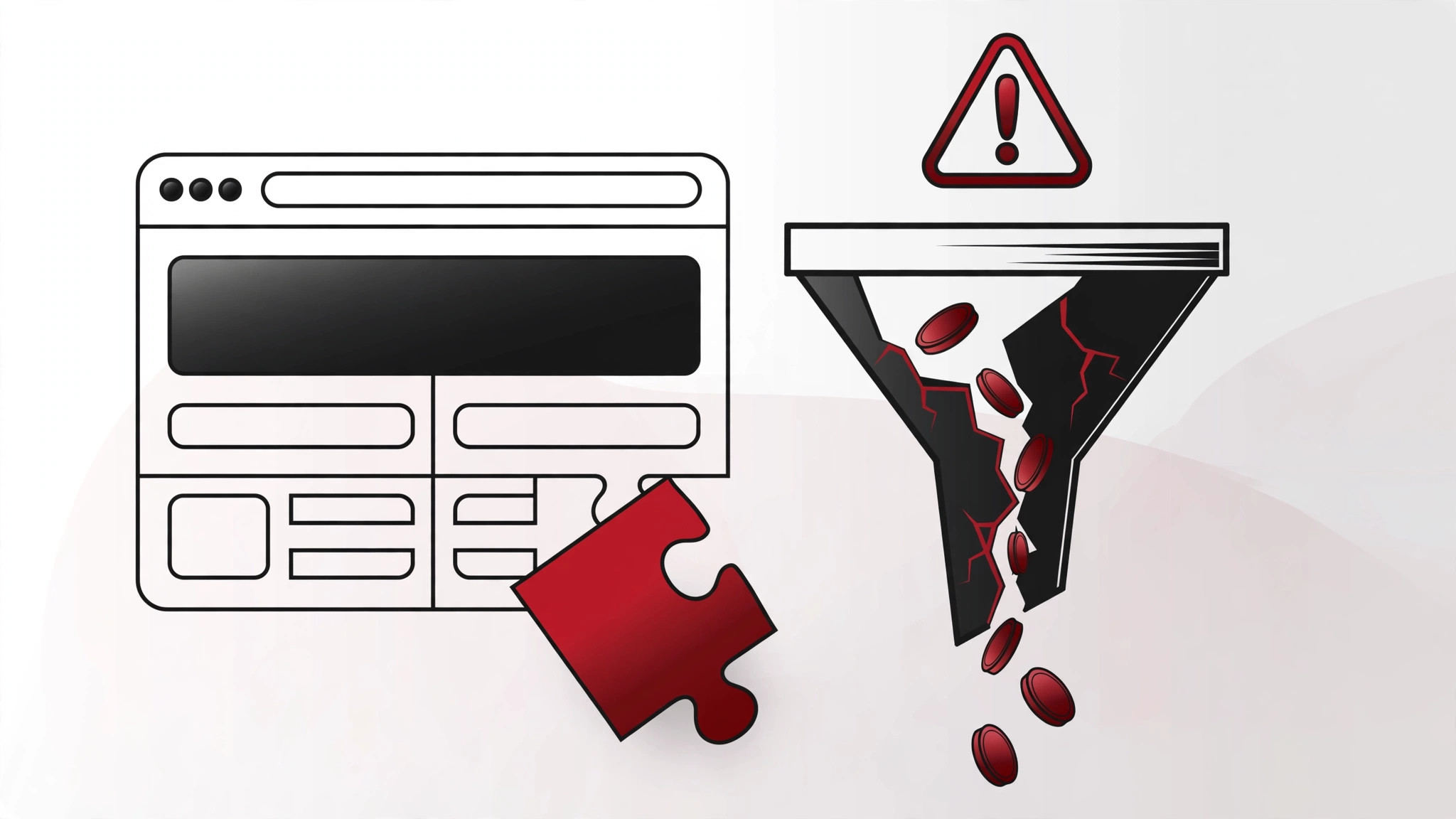
Your website gets traffic. People arrive, look around, and leave without buying, enquiring or signing up. The instinct is to blame the marketing — more ads, more SEO, more social. But often the traffic is fine and the website is the problem: it's quietly killing conversions with design mistakes that are entirely fixable.
Here are four of the most common conversion-killing design mistakes we see on UK business websites — what they look like, why they cost you money, and how to fix each one.
Mistake 1: No clear value proposition above the fold
What it looks like: A visitor lands on your homepage and sees a full-screen stock photo, a vague headline like "Welcome to Excellence" or "Solutions for Tomorrow", and a menu. Five seconds in, they still don't know what you sell, who it's for, or why they should care.
Why it kills conversions: Visitors decide whether to stay within seconds. If the value proposition isn't immediately obvious — what this is, who it's for, and what's in it for them — they bounce back to Google and click your competitor. This is the single most common issue on SME websites, and it has nothing to do with aesthetics. Beautiful sites with unclear messaging convert worse than plain sites with clear messaging, every time.
The fix: Rewrite your hero section around a simple formula: what you do + who it's for + the outcome. "Driving lessons in Manchester from £35 — door-to-door pickup, manual and automatic" beats "Your Journey Starts Here" in every test ever run. Support it with one primary call to action (not three competing buttons) and one piece of proof — a review count, a trust badge, a recognisable client logo. Clarity converts; cleverness doesn't.
How to test it: the five-second test. Show someone your homepage for five seconds, hide it, and ask: what does this business do, and who is it for? If they can't answer, your hero section is failing. This test is free and it exposes the problem in under a minute.
Mistake 2: Friction in the conversion path
What it looks like: The visitor is convinced — they want to buy, book or enquire — and then the process fights them. A checkout with seven steps. A contact form asking for seventeen fields including "fax number". Forced account creation before purchase. A "Get a Quote" button that leads to a PDF download instead of a form. Pop-ups appearing before they've read a word.
Why it kills conversions: Every additional step, field and distraction in the conversion path loses a percentage of users. This is one of the best-documented effects in ecommerce: each extra checkout step increases abandonment, and long forms dramatically reduce completions. Your visitors' motivation is finite; friction spends it. By step four of your checkout, only the truly desperate remain.
The fix: Ruthlessly simplify the path from interest to action:
- Cut form fields to the minimum. Name, email, phone, message — that's enough for most enquiries. Every field you remove increases completions. You can collect the rest later, once they're a customer.
- Offer guest checkout. Forcing account creation is one of the highest-friction moves in ecommerce. Let people buy first; invite them to create an account after.
- One CTA per page section. If everything is a priority, nothing is. Decide the single most important action per page and design around it.
- Kill the premature pop-up. A newsletter pop-up at three seconds is a conversion killer, not a list builder. If you must use one, trigger it on exit intent or after meaningful engagement.
- Make the phone number visible. UK buyers — especially for services — still want to call. Burying your number three clicks deep tells them you don't want to talk to them. A click-to-call button on mobile is basic and still missing on a shocking number of sites.
Mistake 3: Slow, heavy pages (especially on mobile)
What it looks like: A homepage with a 4MB hero video that autoplays, a slider with twelve uncompressed images, three different font families, and a dozen tracking scripts. On a desktop with fibre it's merely sluggish. On a mid-range phone on 4G — which is how most of your visitors arrive — it's a loading spinner and a back button.
Why it kills conversions: Speed is a conversion factor, full stop. The research is consistent and brutal: as load time rises, bounce rates rise steeply and conversion rates fall. Mobile users are the least patient and the most affected — and mobile is the majority of traffic for most UK consumer businesses. A slow site doesn't just annoy visitors; Google's Core Web Vitals mean it also ranks worse, so you're paying for the same problem twice.
The fix: This is usually a technical job, but the principles are straightforward:
- Compress and modernise images. Serve WebP or AVIF, sized correctly for their display dimensions. That 5000px-wide "hero" image displayed at 1200px is pure waste.
- Question the video background. Autoplaying hero videos are the single heaviest common element on business sites. A well-chosen static image with strong copy almost always converts as well or better, at a tenth of the weight.
- Audit your scripts. Tag managers accumulate tags like attics accumulate boxes. Every tracking pixel, chat widget and social feed embed adds load time. Keep what you use; remove the rest.
- Measure properly. Run PageSpeed Insights and check Core Web Vitals for mobile specifically — desktop scores flatter slow sites. Aim for Largest Contentful Paint under 2.5 seconds on mobile.
Speed work often delivers the fastest ROI of any CRO activity because it lifts every visitor, every page, every campaign simultaneously. It's also why ongoing website maintenance matters — sites get slower over time unless someone is watching.
Mistake 4: No trust signals where the decision happens
What it looks like: A checkout or enquiry page with no reviews, no guarantees, no security badges, no company details — just a form asking for money or personal data. Or trust signals exist but they're buried on a testimonials page nobody visits, while the pages where decisions happen are bare.
Why it kills conversions: Buying from an unfamiliar business online requires trust, and trust needs evidence at the point of decision. UK consumers are increasingly cautious — they've been trained by scams, data breaches and disappointing purchases. When your checkout page looks anonymous, the perceived risk of buying outweighs the desire for the product, and they leave to buy from the competitor with 2,000 visible reviews.
The fix: Place proof where decisions happen:
- Reviews near the CTA. Star ratings and review counts next to the buy button or enquiry form, not on a separate page. Google Reviews, Trustpilot or Feefo — whichever you genuinely use.
- Risk reversals. Money-back guarantees, free returns, "no fix, no fee" — whatever genuinely reduces the buyer's risk. State it plainly at the decision point.
- Real company details. A UK address, a phone number, company registration details. Anonymous websites don't get trusted with credit cards.
- Security reassurance at checkout. SSL padlock (obviously), recognised payment logos, and a line about secure payment. It feels basic because it is — and its absence is noticed.
- Real photography. Stock photos of smiling models erode trust; real photos of your team, premises and work build it. This is one of the cheapest trust upgrades available.
A note on honesty: trust signals must be real. Fake reviews, invented statistics and stock-photo "testimonials" aren't just unethical — under UK consumer protection rules, fake reviews are illegal. Use genuine proof or use none.
Where to start: the priority order
If your site has all four problems (many do), fix them in this order:
- Value proposition first. It's the cheapest fix — often just copywriting — and it lifts every page.
- Friction second. Form and checkout simplification usually delivers the biggest measurable conversion lift.
- Trust signals third. Quick to add, compounds over time.
- Speed fourth. Often needs developer time, but lifts everything permanently.
Then measure. Set up conversion tracking properly, establish your baseline conversion rate, and change one thing at a time. CRO without measurement is redecorating — it might look better, but you won't know if it worked. For more on the UX principles behind all of this, read our article on why UX matters for SEO.
Most conversion problems aren't mysterious — they're these four mistakes, in various combinations, on repeat. The good news is that every one of them is fixable, and the fixes are usually cheaper than another month of ad spend sending traffic to a site that can't convert it.
If you'd like an expert eye on your site, our website development team runs conversion-focused website audits for UK businesses — we'll show you exactly where you're losing customers and what fixing it is worth. Contact us to arrange one.
FAQs
What is the most common web design mistake that kills conversions?
An unclear value proposition above the fold. If visitors can't tell what you do, who it's for and why it matters within seconds of landing, they leave — regardless of how good the design looks. Clear, specific hero copy ("Driving lessons in Manchester from £35") consistently outperforms clever or vague headlines.
How much does website speed affect conversions?
Significantly. Industry research consistently shows that slower load times increase bounce rates and reduce conversion rates, with mobile users affected most. Even a one-second improvement can produce a measurable lift in conversions. For most UK businesses, where the majority of traffic is mobile, speed optimisation is among the highest-ROI CRO activities.
Should I remove fields from my contact form to get more enquiries?
Almost certainly yes. Every additional form field reduces completion rates. Stick to the essentials — name, email or phone, and message — and collect everything else after they've become a lead. The information you lose from shorter forms is worth far less than the enquiries you gain.
Do trust badges and reviews really increase conversions?
Yes, when they're genuine and placed at the decision point. Reviews next to the buy button, guarantees on the checkout page, and real company details all reduce perceived risk — which is the main barrier for first-time buyers. Fake reviews are illegal under UK consumer protection law, so only use genuine proof.
How do I know if my website has conversion problems?
Compare your conversion rate against industry benchmarks and your own history. If traffic is steady or growing but enquiries or sales are flat, the site is the bottleneck. Analytics tools showing high bounce rates on key pages, or session recordings showing users hesitating at forms and checkouts, confirm where the problems are.